There can be only one!

“Get on with it!” commands Miss Mia Sopaipilla.

OK. I’ve been judging two newish themes on two old blogs — Penscratch 2 on New Wheeled Order and Independent Publisher 2 on Town & Country — and I’m getting close to a verdict.

Not knowing how people “interact” with the blog leaves me thinking I should probably focus on how the wee beastie looks on a phone. I prefer working it on a laptop — and a laptop hooked to an external monitor when I can get it — but I may be the lone exception.

With that in mind, Penscratch 2 looks cleaner. There’s a menu right at the top for easy navigation. In IP2 I seem to be restricted to putting items like search, archives, bio, and whatnot in a widget area, like a sidebar or footer.

Penscratch 2 seems easier to work, too. I spent some time with it yesterday and almost got to feeling comfortable. I just dropped a photo and caption into the top of this post and it went smoove like butta. In the editing window a sidebar at right gave me the option of selecting a resolution, aspect ratio, and a custom width/height.

And really, that’s what I want from a new theme, if I absolutely have to have one, which is coming to feel inevitable. Operating it should be easy, because sometimes writing is not. Also, it should not blow up the blog, which is 15 years old in its present incarnation.

I’ve relocated most of my sidebar widgets as pages, save for the Radio Free Dogpatch item. That I’ll get to tomorrow, or over the weekend. Then I’ll ask a few folks for their opinions and we’ll proceed from there. I’d like to have the new look ready to rock for New Year’s Day.

Whacking widgets

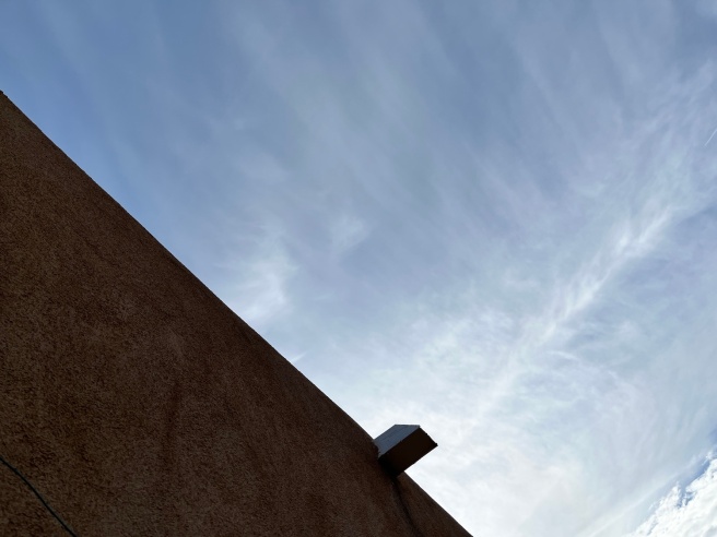
This widget delivers water from my roof to the ground.

The Penscratch 2 theme permits the use of widgets in a sidebar and a couple other locations. But navigating the Widget Experience in the Block Editor (curse its name, yes) is on a par with running around downtown Denver in the Seventies with a head full of acid and a belly gurgling with cheap industrial lager. Very little makes sense or even looks familiar and there is an irresistible urge to throw things off high places, just to see what happens.

So this morning I tossed my sidebar widgets over the edge, thus eliminating the sidebar, and then reanimated a few of them as pages, which for some reason turn up as links in the header. The copyright warning I moved to the widget area at the bottom of the homepage. That took some doing, because the process of adding/sizing an image for the sonofabitch felt like throwing the widget off some high place with the goal of landing it in some tosspot’s half-empty red plastic Solo cup rocking a Tower of Pisa lean in a trash barrel on the sidewalk below using a target-imaging system scrambled like a couple of White Spot cackleberries by blotter and Bud.

As it happens, while I was doing this I got invited to take a survey about themes. So I did. And I didn’t even deploy any vile and actionable language, either.

I’m still waiting for my free prize.

Once more around the Block (Editor)

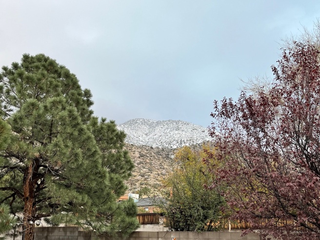
The first day of December is not exactly a snowpocalypse.

Sigh. Here we go again.

Readers are still having various issues with commenting on the blog, the WordPress “Happiness Engineers” don’t seem to be of much help, and I’m not finding any modern themes that strike me as attractive and efficient for a guy who likes to write a few posts with art per week.

The Block Editor continues to be an impediment to thinking and writing, or writing and thinking (they aren’t always happening in their proper order).  With this post I’m using the Classic Block, which means that I wrote the hed, typed a slash into the empty text box, selected the Classic Block from the popup menu, and then began writing the post.

That’s a couple of unnecessary steps involved in creating every single post going forward. But with its Classic-style menu at the top of things it is slightly more familiar than hewing strictly to the Block Environment, which is a veritable minefield laced with Bouncing Bettys that pop up and annoy the mortal fuck out of me while I’m trying to just bang out some word count for giggles.

The next thing is to insert a piece of art, so let’s see how that goes. It being the first day of December I’m selecting a pic of today’s brutal snowstorm, which failed to eventuate. Such is life in the Upper Chihuahuan Desert. Here goes.

There is an unfamiliar “Insert Media” button in the menu, with camera and musical iconography. So let’s go with that.

OK, that seemed relatively straightforward. Hit the button, find the art, size and align, add a caption. Now let’s save the post and see what we have going on here.

Rainy day feeling

Fuck me, but inserting a pic and adding a caption is a giant pain in the ballbag.

Well, here we are again, futzing around with the Block Editor (curse its name, yes) as the rain gauge totes up the day’s numbers and snowy bits in the Sandias make themselves known through the disintegrating clouds.

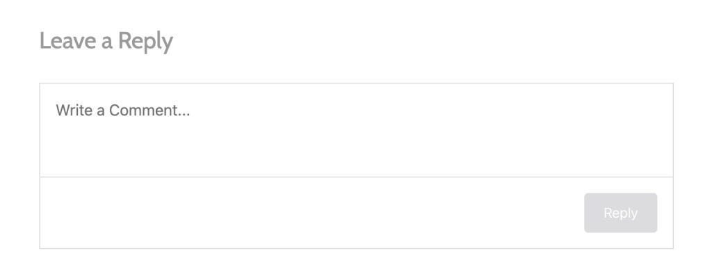
The Wizards claim that the “Leave a Reply” box that annoys the mortal shit out of everyone, especially me, is now the default, so, suck it, bitches.

Well, not in so many words, of course. But when you’re a 69-year-old retired free-range rumormonger blogging for a small, deeply disturbed audience, you learn to read between the lines.

The latest version of the “Leave a Reply” box.

Anyway, if we Little People are getting this overengineered comments clusterfuck shat upon us from on high without so much as a by-your-leave, I figure it can’t be long before they jerk the legs out from under my retired theme and the Classic Editor and leave me weeping on the shoulder of the Infobahn, as nobody calls the Internet anymore.

So I should probably think about larnin’ me some Block Editor son! I bleeve I can ride anythin’ I can th’ow a leg over if I’m drunk enough. Too bad I don’t drink anymore.

Block Editor, Penscratch 2 style

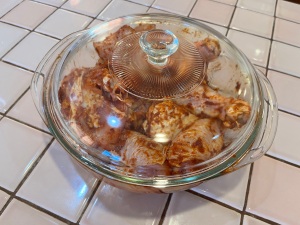
The chicken, it marinates.

Having futzed around to no particular purpose with the theme “Hemingway Rewritten,” I’m fiddling with Penscratch 2, which seems to have a little more going on.

Anyway, my chicken needs a half hour to marinate, so I have time on my hands here.

So far I like Penscratch better than old Hem. I’m not sure about the lightness of the type, but I could change that up.

Is a pull quote any prettier in this theme than in the other? Let’s find out.

And just one post into the sonofabitch I can tell you that this light text will be hard to edit. My eyeballs are already out on stalks.

I’ve already run into one issue with the widgets in the sidebar. The Archive doesn’t come with a headline reading, “Archive,” to like, let people know it’s, like, an Archive, an’ shit. And when I tried to give it one, there was waaaaaaay too much leading between the headline and the actual Archive. So that will take some puzzling out.

And just one post into the sonofabitch I can tell you that this light text will be hard to edit. My eyeballs are already out on stalks.

Would it be easier if the text were darker?

Hm. Not a lot of options available there and they all seem to have a built-in lightness. We’ll have to test-drive some other fonts.

• Update: Swapped out the headline and body fonts for something darker and they look betterer. Alas, the update does not appear in this editing interface, What the actual fuck. …

• Update the Second: I found a way to remedy that in Settings. A non-intuitive way, of course. The editor was showing the old Penscratch typography, so I switched off a button that said, “Make the editor look like your site” or some such shit.

• Update the Third: Fuck me, I just had to tell this piece of shit for a second time to leave that old Penscratch typography in the shitheap where I found it.