Having futzed around to no particular purpose with the theme “Hemingway Rewritten,” I’m fiddling with Penscratch 2, which seems to have a little more going on.
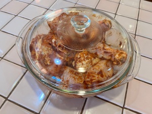
Anyway, my chicken needs a half hour to marinate, so I have time on my hands here.
So far I like Penscratch better than old Hem. I’m not sure about the lightness of the type, but I could change that up.
Is a pull quote any prettier in this theme than in the other? Let’s find out.
And just one post into the sonofabitch I can tell you that this light text will be hard to edit. My eyeballs are already out on stalks.
I’ve already run into one issue with the widgets in the sidebar. The Archive doesn’t come with a headline reading, “Archive,” to like, let people know it’s, like, an Archive, an’ shit. And when I tried to give it one, there was waaaaaaay too much leading between the headline and the actual Archive. So that will take some puzzling out.
And just one post into the sonofabitch I can tell you that this light text will be hard to edit. My eyeballs are already out on stalks.
Would it be easier if the text were darker?
Hm. Not a lot of options available there and they all seem to have a built-in lightness. We’ll have to test-drive some other fonts.
• Update: Swapped out the headline and body fonts for something darker and they look betterer. Alas, the update does not appear in this editing interface, What the actual fuck. …
• Update the Second: I found a way to remedy that in Settings. A non-intuitive way, of course. The editor was showing the old Penscratch typography, so I switched off a button that said, “Make the editor look like your site” or some such shit.
• Update the Third: Fuck me, I just had to tell this piece of shit for a second time to leave that old Penscratch typography in the shitheap where I found it.
